Thank you Timber! I love these quick teaching tuts.
I gave it a try and I love the results for a tile. Looked great.
And you know how much I love tiles.
When I tried the tile as a text fill I didn't really like the results, so...
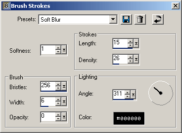
I did a western text (Oklahoma) at 60 with a stroke of 2, aligned center, selected from vector, modified by 2 and converted to raster. Then I applied the noise, the brush stroke - soft blur, added a bevel (screen shot) and a drop shadow 2,1,25,3 Black.
I like the way those settings look on a tag. very nice.


 Post Codes
 PSP Challenges
 Smileys
 Taggy Me
 Thank you so much, JJ!
 And the doll you picked is gorgeous!