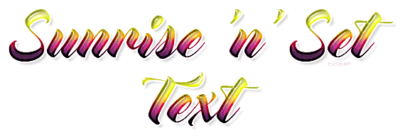
This tutorial will demonstrate one of the cool Animation Shop Image Effects called Fade To Grey. Used in combination with a text fill of a light-to-dark color palette, I think it gives the illusion of a sunrise and sunset on text.
I glassed my text with SuperBladePro, but you don't need it to complete the tutorial. You can use another glass filter if you like, or use an inner bevel, or leave the text flat. You can browse through the Text Tutorials Index for some tutorials on the list that teach you how to get a glassy effect without using any plugin filters (look for "plastic" or "glass" on the index page).
I originally wrote this tutorial as a Script Version, but then I realized those instructions were more for a tagger who will make multiple tags with a range of text widths and possibly having two lines of text. I didn't want to complicate a tag that is actually quite simple, so I wrote a No-Script Version. Since I already have the scripts for this tag I will include those and the instructions for anyone who wants to give the script a play. Just scroll down to the Script Version or click here.
Your results will vary depending on what font and palette you choose. My header and tutorial samples are based on the Pungent color palette and the Mocking Bird font. I will include some tag variations at the bottom of the tutorial to show you some options using this animated image effect. |
For this tutorial, you will need:
Paint Shop Pro (version 8 or higher)
Animation Shop
SuperBladePro (optional)
Meadow's Studio CoconutIce Clear Glass Preset
Mocking Bird or a font of your choice |
Choose A Color Palette
I will be using the Pungent color palette from COLOURLovers, but you can use another color palette of your choosing.
- go to COLOURLovers;
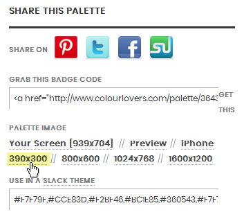
- search for "pungent" in the search box at the top of the page;
- click the "pungent by eighteyed" palette from the results; scroll down a bit and look for the share this palette section on the left side; click the 390x300 link and save the palette to your computer;
|
Simple NO-Script Version
- create a new image: 600x400px, raster background, white;
- open color palette in PSP and paste onto the canvas as a new layer; rename "palette";
- image>rotate>free rotate: right, 90degrees, all layers UNchecked;
If you're using a palette with the lightest color on the right-side of the palette, then rotate counter-clockwise.
- selection tool; custom selection: L/300, T/5, R/350, B/395, use current selection as default UNchecked;
These custom selection settings are based on the color palettes from COLOURLovers. If you're using a different color palette then use values that will select the portion of the palette that you want to use for your text fill.
- gaussian blur=25; copy selection; select none; hide the palette layer;
- text tool: create as vector, mocking bird, size 72, stroke=0, anti-alias=checked;
- materials palette: FGcolor=white, BGcolor=any color;
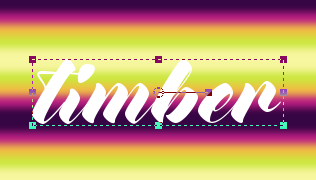
- add new vector layer name "text"; type text (adjust kerning as desired); center on canvas;
- selections>from vector object; add new raster layer name "shadow"; drop shadow: 4,4,25,4,#404040; layers>arrange>move down;
- text layer active; add new layer name "ice"; paste into selection; apply SuperBladePro M_coconutice preset;
- add new layer name "outline"; paste into selection; contract selection by 3; delete selection; select none; set blendmode=multiply;
For darker color palettes, you can set the blend mode to burn for a not-so-dark outline.
- text layer active; edit text: set stroke=4.5;
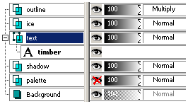
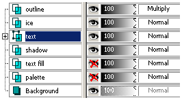
Here's a view of the Layers palette up to and including this step.
- place watermark;
- hide background layer; crop; unhide background;
- skip to Animate the Text section here
|
Script Version
For the Script Version of the tutorial you will need the two scripts that I wrote. One script takes your chosen color palette and will create a layer on the canvas with blurred bands of color from the palette, and the second script will create the text. So it's a two-part process.
The Custom Selection settings that I have used for the script are based on the font that I chose, Mocking Bird, the font size, and the Pungent palette. After you run the script at least one time as written, then I recommend you run the script in Interactive Script Playback Mode and make changes to those settings to suit your font, font size, or color palette. I will provide yellow-highlighted notes below for where you can make changes while running the script in Interactive Script Playback Mode.
Supplies here: place these two scripts into your Scripts-Restricted folder
tbt-SunriseNSetCanvas PSP Script: for creating the canvas
tbt-SunriseNSetText PSP Script: for creating the text
- create a new image: 600x400px, raster background, white;
- open the color palette in PSP and paste onto the canvas as a new layer;
~RUN SCRIPT: tbt-SunriseNSetCanvas
- rename "palette";
- image>rotate>free rotate: right, 90degrees, all layers UNchecked;
If you're using a palette with the lightest color on the right-side of the palette, then rotate counter-clockwise.
- selection tool; custom selection: L/300, T/5, R/350, B/395, use current selection as default UNchecked;
These custom selection settings are based on the color palettes from COLOURLovers with five (5) colors of even spacing. If you're using a different color palette then use values that will select the portion of the palette that you want to use for your text fill.
- gaussian blur=25;
This blur setting is based on the Pungent color palette or another palette from COLOURLovers with five (5) colors of even spacing such as the Thought Provoking palette shown below in the Variations section. If you are using a smaller selection of palette, then adjust the blur amount so the visible separation between the colors of the palette are blurred to your liking. Using a too-high blur amount will turn your blur selection into mud.
- copy selection; select none; hide the palette layer;
- add new layer "text fill"; custom selection: L/0, T/70, R/600, B/130;
These custom selection settings are based on the approximate height of my font, Mocking Bird, set at size 72. This is another area where you can experiment with the script by changing the bottom value to create a more narrow or wider selection.
- paste into selection; select none;
- duplicate; image>flip;
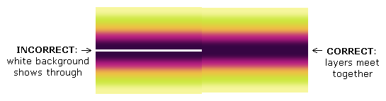
- effects>image>offset: H/0, V/140, custom, transparent;
This offset is based on the 60px custom selection made in step#8. If you created a selection different than 60px, then you will most likely need to adjust the vertical offset at this step. Adjust the vertical offset, so the two layers meet together; you shouldn't see any of the white Background showing through where the two layers meet.
- merge down; duplicate; offset: H/0, V/-120;
Adjust the vertical offset as needed.
- merge down;
~END SCRIPT
Create the Text
- text tool: create as vector, mocking bird, size 72, stroke=0, anti-alias=checked;
- materials palette: FGcolor=white, BGcolor=white;
- add new vector layer name "text"; type text (adjust kerning as desired);
- place text layer on canvas, so the top of the letters is in the lightest shade of the palette and the bottom of the letters is in the darkest shade;
Alternatively, you can place the text wherever you'd like. Whatever part of the text fill layer below the text is what will be pasted into the text selection.
- objects>align>horz center in canvas;
~RUN SCRIPT: tbt-SunriseNSetText
- selections>from vector object; add new layer "shadow"; drop shadow: 4,4,25,4,#404040; layers>arrange>move down;
- text fill layer active; promote selection to layer; hide text fill layer; layers>arrange>bring to top; rename "ice";
- duplicate layer; rename "outline";
- ice layer active; apply SBP M_coconutice preset;
- outline layer active; contract selection by 3; delete selection; select none; set blendmode=multiply;
For darker color palettes, you can set the blend mode to burn for a not-so-dark outline.
- text layer active; edit text: set stroke=4.5;
~END SCRIPT
You can edit>undo script at this point, place your text on a different area of the canvas, then run the script again. This allows you to see how different portions of the text fill layer will look in the text. Try it; it's fun! LOL
- place watermark;
- hide background; crop; unhide background;

|
Animate the Text
- copymerged and paste into Animation Shop as a new animation;
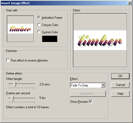
- effects>insert image effect: start with=animation frame, run effect in reverse=UNchecked, effect length=2.0secs, frames per second=5fps, effect=fade to grey;
- select frames 2-10; copy;
- select frame11; paste after the current frame; animation>reverse frames;
- select frame11; set display time to 100;
- select frame1; set display time to 200;
- view the animation;
Double check that you've reversed the copied frames. If you see an odd "skip" in the animation, then undo your way back to the step where you pasted the frames. Then make sure that you reverse the frames. The animation should be a smooth transition from colored text to grey text and then from grey back to color.
- Save as: median cut, nearest color (or error diffusion if you think it looks better)
After saving your animation check to make sure you have 20 frames. In one of my tests, I noticed that my animation didn't look smooth, so upon closer inspection I discovered that I only had 18 frames.
 |
| Variations |
For this sample, I used the Thought Provoking Palette by Miss_Anthropy. I set Blend Mode=Burn for the outline layer.

For this sample I used the Tropical Sunset Palette by EllenMarley and the font, Buttermilk. This is a pretty palette but the dark portion of the palette was too wide, so I adjusted the custom selection of the palette by changing the bottom value to 250 (instead of using 395).
Even with the removal of much of the dark portion of the palette, the dark part of the text was quite dark and the light part was quite light. I wanted to darken the light part and lighten the dark part. I'm sure there's a "normal" way to do this but I don't know how LOL, so this is what I did to darken the light and lighten the dark.

- create a text selection with stroke=0;
- add new layer at top of palette; fill the selection with the foreground-background gradient (FGcolor=#C0C0C0, BGcolor=black);
- apply the coconutice preset;
- set blendmode=overlay;

I can't wait to see what variations you come up with!
See member results HERE
You may offer your results wherever you wish, but you may not sell for profit.
This tutorial was written by timber on August 11, 2018. |
|
 Post Codes
 PSP Challenges
 Smileys
 Taggy Me
