LOL Judy beat me to the punch. I was playing with this last night but my computer time was cut short, so I didn't get to finish.
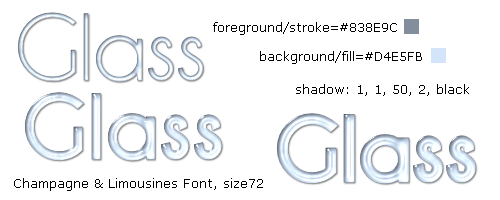
Here's what I think Kes did to make her header. I took the colors of the borders around the tutorial and used one for the fill and one for the stroke=1. I don't know what font she used but I found one that was similar in thickness (this is the key to getting a similar look). I used the same inner bevel setting and the same settings using Eye Candy 3. I missed the part about her drop shadow settings so I used what I thought was close.
I made three samples to show you how differently the same settings look on different thicknesses. I think the sample with the middle thickness looks closest to the tutorial header.
 Post Codes
 PSP Challenges
 Smileys


 I totally love what the two of you resulted with! I honestly thought that maybe a different plugin was used or something, though it would have been weird since it was tuting (lol TUTING) EC lol