Página principal  |  Contato  

Correio eletrónico:

Palavra-passe:

Registrar-se agora!

Esqueceu-se da palavra-passe?

Treehouse Treasures
 
Novidades
  Entre agora
  Painel de mensagens 
  Galeria de imagens 
 Arquivos e documentos 
 Inquéritos e Testes 
  Lista de participantes
 ►► How to Join ◄◄ 
 ►Getting Started 
 Please Read 
 -:¦:--:¦:- Messages -:¦:--:¦:- 
 ♥ General 
 ♥ Daily Greetings & Checking In 
 ♥ Broken Links 
 ♥ Post Office 
 ♥ PSP Lessons 
 ♥ Chat 
  Post Codes 
  PSP Challenges 
  Smileys 
 -:¦:-:¦:- Tag Galleries -:¦:-:¦:- 
 ♥ Artist Appreciation 
 ● Autumn 
 ▲Christmas 
 † Halloween 
 ■ Pirate 
 ╠ Steampunk 
 ♣ St. Patrick`s Day 
 :¦: Winter 
 -:¦:--:¦:-Tutorial Links-:¦:--:¦:- 
 ● Animation Shop Tuts 
 ● Autumn Tutorials 
 ● Blinkie Tutorials 
 ● Halloween Tutorials 
 ● Member Tutorials 
 ● Old School Tutorials 
 ● Text Tutorials 
 ● Christmas Tutorials 
 ►►► JUDY TUTS ◄◄◄ 
 ● Animated Filmstrip 
 ● Cutout Text 
 ● Diamond Jiggler Bling 
 ● Diver Smiley Tag 
 ● Flag Glitz Glitter 
 ● Gardenhose Tag 
 ● Glitz Glitter 
 ● Making Movies 
 ● Rainbow Motion Text 
 ● Tiny Box Smiley 
 ● Twinkle 
 ● Vector Text Node Edit 
 ● Watery Grave 
 ►►► KARLA TUTS ◄◄◄ 
 ♥ Coloring Pages: Color & Edit 
 ♥ Dazzle Doll Glitter Sig 
 ♥ Glitter Sig 
 ♥ Kamikaze Halftone 
 ♥ Mish Mash Text 
 ♥ Stellar Bling Text 
 ►►► REBEL TUTS ◄◄◄ 
 ● Chrome Bling`n Text 
 ● Gold & Diamonds 
 ►►►TIMBER TUTS◄◄◄ 
 ● Amazon Southwest 
 ● American Idol Noisy 
 ● Autumn Deco Spice 
 ● Billo Disco Love Trail 
 ● Blackout Scene Text 
 ● Carnivale Cane Text 
 ● Etched Glass Text 
 ● Gold Bling Text Revised 
 ● Groovy Text 
 ● Hearts Aglitter 
 ● Herringbone Frame 
 ● Hollywood Fireworks 
 ● Holy Ravioli Serape Text 
 ● Itty-Bitty Blinkie 
 ● Melted Candle Text 
 ● Patriot Text 
 ● Pique Glitter Drops Text 
 ● Planet X Space Text 
 ● Ribbon Candy Text 
 ● See-Through Text 
 ● Shiny Metal Stud 
 ● Snowman Bar 
 ● Sunrise `n` Set Text 
 ● Windy Halftone Text 
 ►► MEMBER TUTS ◄◄ 
 ● DrumagStudioNF Text 
 ● Glass Text 
 ● Surfer Tag Text 
 -:¦:--:¦:--:¦:--:¦:--:¦:--:¦:--:¦:--:¦:-:¦:- 
 ►►►►►►►►►►►►► 
 Taggy Me 
 ● GBTRT Page 2 
 ● IBBBT Page 2 
 ● IBBBT Page 3 
 ● PTT Page 2 
 ● PXST Page 2 
 
 
  Ferramentas
 
General: Tutorial Challenge: Rainbow Motion Text by Judy
Escolher outro painel de mensagens
Assunto anterior  Assunto seguinte
Resposta Eliminar Mensagem  Mensagem 1 de 18 no assunto 
De: justjam  (Mensagem original) Enviado: 11/03/2012 20:36
Rainbow Motion Text


Click the tutorial name to go to the tutorial.

If you have any questions about this tutorial, please ask them on this thread.

And don't forget to show off your results when finished!


Primeira  Anterior  4 a 18 de 18  Seguinte   Última  
Resposta Eliminar Mensagem  Mensagem 4 de 18 no assunto 
De: timber Enviado: 12/03/2012 03:17
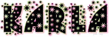
Okay, I went back to the drawing board and had intended to use a rainbow-ish pattern that I had created, but when I saw the text with it, and I tried different fonts, I thought the result looked horrible.  So instead I decided to play with one of my own rainbow gradients.  I still want to try this again with a pattern, but here is my second result using a different font and my gradient.

tbt12timberRainbowMotion2

The font is SF Technodelight.  I "dressed" up the text just a bit, but I refrained myself from glassing it .  Because of the sharp points on the stars, I didn't use the expand and fill method.  I created my text in vector format , and then I duplicated the text and edited it (I added a stroke=2.5 and used the gradient for the stroke material).  Then I moved this vector layer below the plain black text layer.  By doing the "outline" this way, I maintain the points of the stars.  It's more work to do it this way, but if you want to keep points on the outline of text or any other shapes, this is the method that I have discovered works.  Otherwise the points are softened by expanding the selection.

Resposta Eliminar Mensagem  Mensagem 5 de 18 no assunto 
De: justjam Enviado: 12/03/2012 03:27
Awesome results Timber.  I love the font you used and the points on the stars are too cool! 
I love the idea of using the gradient  for the stroke also.
Wow, I have more things to try now.  Thanks for sharing your results and your settings.

Thanks also for playing ...... I'm off to see if I have that font. 

Resposta Eliminar Mensagem  Mensagem 6 de 18 no assunto 
De: timber Enviado: 12/03/2012 04:23
Thanks, Judy, and you're very welcome!

Resposta Eliminar Mensagem  Mensagem 7 de 18 no assunto 
De: Cheetah Enviado: 14/03/2012 21:00
ty-glittertut-bycheetah 
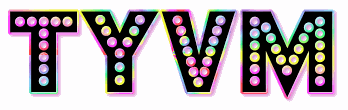
for this tutorial - great effect - beautiful tags .. I used the font Budmo Jiggler - you can find it HERE

Resposta Eliminar Mensagem  Mensagem 8 de 18 no assunto 
De: justjam Enviado: 14/03/2012 23:15
Cheetah I love the font and bright colors that you used!
Did you use a gradient?

Thanks for trying the tut...I hope you could do it ok in
PSP 7.  I've been collecting things to do a hippie/tie-dyed tag. 
Those colors would be awesome. 

Resposta Eliminar Mensagem  Mensagem 9 de 18 no assunto 
De: JessieJo Enviado: 21/03/2012 21:50
Fabulous effects and tags!

Resposta  Mensagem 10 de 18 no assunto 
De: justjam Enviado: 02/08/2018 21:47
I have never tried this tut with a glitter fill so I decided to try a multi-colored glitter.
 
I found one of Karla's called SE_TyeDye_C and gave it a try.
 
 
It's not quite as colorful as the gradient, but I wonder what it would look like if I rotated the fill?
 
I have more playing to do. 


Resposta  Mensagem 11 de 18 no assunto 
De: SilentEyez Enviado: 03/08/2018 05:29
Hi ladies! Love the tut and the shared results! All of you did a fantastic job! Now, I wonder if I would be able to do something just as fantastic :-D 

Oooh that looks good Judy! Using the tye dye glitter was another fun idea :-) Did you or do you ever enhance the color of your work? I always adjust the colors to make it brighter/pop or stand out a bit more. 

Resposta Eliminar Mensagem  Mensagem 12 de 18 no assunto 
De: justjam Enviado: 03/08/2018 05:54
Here is my latest play
 
 
I used SF Technodelight for the font and a multi pattern I have.  I scaled the pattern to 20 and changed the angle of the pattern fill from 0 to 40 to 135 for each of the three layers.
 
I think it looks pretty cool on a black background. 

Resposta Eliminar Mensagem  Mensagem 13 de 18 no assunto 
De: SilentEyez Enviado: 03/08/2018 08:24
Oh Judy, now that is super colorful and gorgeou! Works perfect with a black background!

Well, my PSP 8 does NOT have the rainbow pastel (in fact, it does not have a lot of gradients). I tried it with the Landscape Sunset grad and NOOOOOO WAY, it came out too FUNKY! Plus, I messed up somewhere along the tutorial because this is how mine came out. I used the gradient you posted along in the tutorial page. I added 3 bottom layers with the filled gradient and the # settings for each text layer effect of "movement". That way, I did not have to fill the expanded "outline". I will have to give this another try because I have NO clue why I always miss something or mess something up :-D
 
 
--------------------------------------------------------------------------------------
 
OKAY. I am back and I think this time it came out a lot better lol And I even added DSB Flux > Bright Noise > 30 intensity, Mix on each gradient layer. The font I used is Glitzy Curl at 68pt.
 

Resposta  Mensagem 14 de 18 no assunto 
De: Daphne70 Enviado: 07/01/2020 04:23
  Very nice tut , not sure I have the animation correctly got a bit confused on the layers to merge... but still looks pretty

Resposta  Mensagem 15 de 18 no assunto 
De: justjam Enviado: 07/01/2020 05:44
Daphne,
I love your results.  I am glad you tried the tut!
 
Judy
 

Resposta  Mensagem 16 de 18 no assunto 
De: MAYRA CUETO Enviado: 01/01/2021 23:16


Texto de movimiento Arco IrisMayra de Buelvas
Barranquilla_Colombia
01-01-20221 06:17 o.m

Resposta  Mensagem 17 de 18 no assunto 
De: timber Enviado: 05/01/2021 15:14
Great results , Mayra, thanks for showing them!


Resposta  Mensagem 18 de 18 no assunto 
De: SilentEyez Enviado: 28/12/2025 22:09

I wanted to give this another go and was pleased to have a better result this time. I did not make it as a Raster but instead worked the layers as Vector. I was a little confused but then got the hang of it. I was trying out another font too but I skipped a step and gave up lol I will certainly try it again. I think it is a fabulous tutorial! Great for a New Year`s and party themes!


Primeira  Anterior  4 a 18 de 18  Seguinte   Última  
Assunto anterior  Assunto seguinte
 
©2026 - Gabitos - Todos os direitos reservados