|
|
| من: timber (الرسالة الأصلية) |
مبعوث: 02/03/2012 02:47 |
Five Colors
I loved the simplicity of this tutorial; I found it fairly quick and easy to do. For this tutorial you'll need MuRa's Meister Copies and Eye Candy 4000 Gradient Glow. The Gradient Glow filter was only used for the text, and I got a similar effect on my text by using a stroke value. Take your time and read which layer to make active before you paste anything as a new layer; I didn't read carefully and I got confused along the way until I took my time and read the tutorial   . .
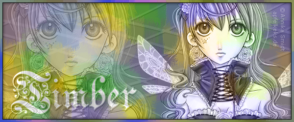
After applying the MuRa's Copies and then the Brush Strokes, I found that the "blobs" of color were too large and I didn't like the effect with this tube. So I redid those steps and changed the Copies setting to Wallpaper Shrink; this gave me smaller blobs of color. Then I applied Distortion Effects/Pixelate (50, 50, symmetric) to further shrink the blobs of color, and then I applied the Brush Strokes. These extra steps make the swatches of color smaller and not so blobby LOL. After I created the line and applied MuRa's Copies, I felt that the straight lines were too modern and didn't seem to fit this victorian image. So after creating the line I bent it by applying Distortion Effects/Lens Distortion (387, 425, fisheye, 114, repeat). I followed the tutorial by duplicating the layer and flipping it, then merged the two layers together and applied Copies (I changed the number to 5). The resulting pattern looked to me like the laced collar that the girl is wearing. I wasn't trying to achieve this result, but I liked the tie-in, no pun intended, so even though the pattern is a little busy I kept it that way. I added a slight drop shadow to the lines (1, 1, 25, 2, black) to give them more dimension. I deleted the drop shadow over the close-up of the face. I used Celebration Text Fancy Normal Font for my name, and I added an extra text layer below my white text with a stroke value of 4 for the gradient glow effect. I added a drop shadow to the lower text layer (1, 1, 50, 2, black). I used MS Reference Sans Serif Font for the artist credit.
Have fun with this one; I can't wait to see your results. |
|
|
|
 أول
سابق
2 إلى 7 من 7
لاحق
أول
سابق
2 إلى 7 من 7
لاحق
 آخر
آخر
|
|
|
|
من: timber |
مبعوث: 02/03/2012 02:53 |

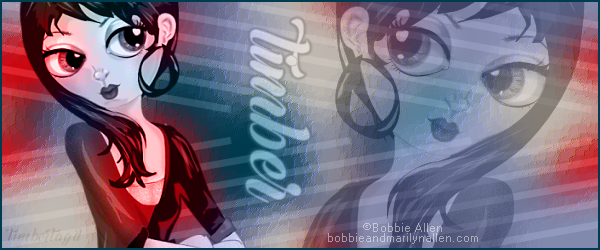
For this tag, I followed the tutorial as written in regards to the background and lines layers. I repeated some of the same techniques on this tag that I used in my tag above in regards to the drop shadow over the close-up and my text. I used Elektra Font for my name and Pixelette Font for the artist credit. |
|
|
|
|
|
من: timber |
مبعوث: 30/05/2018 02:59 |
These are the Brush Strokes settings that I used that gave my background layer a sort of shower door effect (86, 160, 4, 78, 1, 88, 297, #2B2873). For my text, I used Margueritas font, changed the Blend Mode to Luminance (L), and reduced the Opacity to 50. For the artist credit I used Microsoft Sans Serif font (anti-alias turned OFF), changed the Blend Mode to Screen, and reduced the Opacity to 66. |
|
|
|
|
|
من: justjam |
مبعوث: 31/05/2018 02:48 |
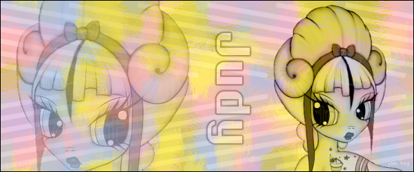
Here are my results from my first try at this one.
When working on the background and applying the Mura Meister-Copies with the wallpaper (rotate) default settings, I changed the scale to 33 to make the blotches of color smaller.
Now that I've done it once, I want to do it again with different colors.
I used a font called Chicago FLF, which is free to use. I also lowered the opacity of my name.
Thanks for the challenge! |
|
|
|
|
|
من: timber |
مبعوث: 31/05/2018 04:39 |
Ohhh, that's cute, Judy! I love all the girly colors you chose. Are those colors you picked from the tube or just random pastel colors? They are really pretty used all together. Thank you for always jumping in so fast to try out these challenges and for sharing your settings!  I think of these challenges as sort of mini tutorials when the different settings are shared, so thank you. I have another one of these tags made and waiting for me to pick a font. As you know it's one of the most time consuming parts of completing a tag *sigh*. I have a few tags that have never been seen because I couldn't find a font that I was happy with  LOL.  |
|
|
|
|
|
من: justjam |
مبعوث: 31/05/2018 18:52 |
Thanks timber.  The colors turned out a little more dominate than I wanted, but I plan to try this one again. 
The colors were not from the tube. I have trouble combining colors that work well together and so I often rely on color palettes of others.  I have several palettes saved from back in the day when I was so absorbed with pixels. I used one of those to choose the five colors.  LOL
I know!! Selecting the right font is so stressful!  I have the same problem, but sadly, I often go with a font I wish I hadn't chosen. 
|
|
|
|
|
|
من: timber |
مبعوث: 01/06/2018 02:28 |
Typically I have chosen the five colors from the tube I used, but after seeing your results, Judy, I realize that I can pick any five colors. I have a thread for Color Palettes here on the PSP Supplies message board. There is one site in particular, Dangerously Delicious Designz, that has beautiful color palettes, so I may have to do this tutorial again and choose one of those palettes. I know what you mean about the colors seeming too dominant. Take a look at the notes for my first tag. I used Mura's Wallpaper Shrink and Distortion Effects/Pixelate to make the blobs of color smaller. The Wallpaper Rotate setting keeps the color blobs quite large while the Shrink setting creates different sizes of blobs (splotches? blotches? you know what I mean LOL).  |
|
|
أول
سابق
2 a 7 de 7
لاحق
آخر
|
 Post Codes
 PSP Challenges
 Smileys