|
|
| De: timber (Missatge original) |
Enviat: 20/07/2018 07:03 |
Water Park
Here's a fun summer font for you to play with; it's very unusual. At first I didn't like it  , and then the more I looked at it I did, so go figure , and then the more I looked at it I did, so go figure  LOL. You can make a text tag like I did or another kind of tag and use this as the font. I just happen to be kind of a text tag addict, as you know LOL. You can make a text tag like I did or another kind of tag and use this as the font. I just happen to be kind of a text tag addict, as you know  . .
I used a bubbles animation commonly referred to as a floaty. I wanted to simulate bubbles rising from the dark, deep blue sea up towards the lighter shallow waters of the ocean. I know it kind of looks like a lava lamp  but it's bubbles but it's bubbles  LOL. I think this font would look great with the underwater effect in Animation Shop or perhaps some tropical fish swimming through the text. LOL. I think this font would look great with the underwater effect in Animation Shop or perhaps some tropical fish swimming through the text.

For the bubble fill I used a Sayclub Accessory. It's actually the smaller display image rather than the full-size image. I have both of these images in my Sayclub Photobucket if you'd like to take a look here. This was the first floaty that I used but because of the "skip" in the animation I went on a search for a seamless bubble animation; I wasn't successful. I experimented with many other bubble animations but I wasn't satisfied with any of them so I ended up using the first one that I worked with which actually looked the best. That was definitely a lesson in persistence. But because of it, I now have quite a few more bubble animations. To prepare the floaty for use I had to remove the white background from each of the frames. Then I selected around and deleted any of the incomplete bubbles at the top and/or bottom of each frame. I found that this reduced the visible "skip" in the animation. There's still a bit of a skip but at least every bubble is whole. I set the Blend Mode to Overlay. For the text fill I used a linear gradient with colors #0000C0 and #00FFFF. For the 1.0 pixel stroke I used a linear gradient with colors #0B3D91 and #8FD9E6 with Blend Mode set to Multiply. I glassed my text with SuperBladePro Coconut Ice Preset. The Drop Shadow settings I used are: 2,3,25,3,#000040.
I have uploaded pressies  for Judy and Karla into the Tag Drop Off album. If anyone would like one of these tags, then just leave a note in this thread, and I'll hook you up! for Judy and Karla into the Tag Drop Off album. If anyone would like one of these tags, then just leave a note in this thread, and I'll hook you up!
If you have a go at this challenge I would love to see the tags that you create!  |
|
|
|
 Primer
Anterior
2 a 16 de 16
Següent
Primer
Anterior
2 a 16 de 16
Següent
 Darrer
|
|
|
|
De: justjam |
Enviat: 21/07/2018 00:59 |
Wow timber, this is a cool font and I love the challenge. I played with it a bit this afternoon and tried various ideas. Here is the first one. I made a snag if anyone wants to use it.
I used an animated background fill that I made called sand and sea. After adding the fill, I added noise to each of the four layers using Gaussian 16 with Mono checked.
Then I used EC 4000 Glass on each of the layers with the settings of 6.99, 75, 3, 0, 50, 0, 40, wht.
I used a drop shadow of 3, 3, 25, 3.00 black.
I'm not finished with this font yet, LOL. I have a couple more ideas. 
Thanks so much, timber for my gorgeous new tag. I love it. 
|
|
|
|
|
|
De: SilentEyez |
Enviat: 21/07/2018 08:17 |
Oh. Em. Gee! This is a super summery watery taggy challenge! Love it! And I absolutely love the pressie! Thank youuuuuuu, Timber!!!!! Judy, your snaggy taggy came out awesome! Pretty colors and love the idea of the sea & sand ;-)
|
|
|
|
|
|
De: timber |
Enviat: 21/07/2018 22:51 |
 Oh, wow, Judy... what a great fill to choose for this font  ; I love it! Thanks for sharing  the snag. Did you make the fill from a tutorial that you can share? Or is this another tutorial for you to write? LOL You're both welcome for the tags!  |
|
|
|
|
|
De: justjam |
Enviat: 22/07/2018 04:22 |
Here is my second play. I wanted to add some graphics, but could not find what I was looking for. 
I was inspired by raindrops and wanted it to look like water.
For this one I used a "floatie" fill called waterdropdkbluex.gif. I am not sure where I got it.
I used a stroke of 1 with color #0026FF and bkg fill #8294F0. I contracted the selection by 1 and created a new layer for each of the 8 layers for the fill. I lowered the opacity of the first text layer with the fill of lt blue #8294F0 to 50 percent. This layer was above all of the drop fill layers.
While the fill area was still selected, I filled another layer with white and moved it below all the other text layers. I did this because the water drop fill was transparent and the lt blue fill layer was only 50 percent opaque.
I used EC glass on the lt blue "50 percent opaque layer" with the settings of 6.99, 75, 3, 0, 50, 0, 40, white.
I used a drop shadow of 2, 2, 50, 4, black.
Thanks again, timber. I enjoyed playing with this font.
Timber, my animated fill on the first tag was created from a gradient that I made. I used the push tool on it to "warp" it a bit. There is no tutorial. Guess I might try to write a quick one, LOL.  |
|
|
|
|
|
De: timber |
Enviat: 22/07/2018 04:52 |
Awesome, Judy, I love your new tag! The falling drops do remind me of rainfall. Are you hoping for some rainfall in Oklahoma to cool it down there? LOL Aren't those animated drops fun to play with? I love working with them. They are from Aardvark Animations and you can get them here. I love the smaller size that you used for your name. It looks good for these smaller drops. My bubbles were kind of big so I used a larger font size (100). What font size did you use for your tag? I like your idea  and I think I'll give it a play with a smaller font size. Thank you for sharing all your tag notes!   |
|
|
|
|
|
De: justjam |
Enviat: 22/07/2018 05:16 |
Thanks timber, I like your bubble fill better. You put in a lot of work on your bubble fill and it looks fantastic!
I used size 72 for the text on this tag. I thought the fill looked familiar, LOL. For some reason it was separate from my other Aardvark animations in my folders.
I couldn't get the link you posted to work. I guess they are now gone from the wayback machine too. 
I have some of their animations saved in my photobucket acct. that I need to download. I do like to play with their fills.
I have noticed recently that the animation delay is not correct when I download them from PB. Such a pain!
Hugs,
|
|
|
|
|
|
De: timber |
Enviat: 22/07/2018 05:27 |
Whoops... my bad! I keep forgetting to check the address for the wayback links because they are so long that I usually have a space in there which breaks the link. I have most of these animated tiles saved, so if you're looking for a particular set let me know. Aardvark Animations Design Tiles Drops01What do you mean by "the animation delay"? |
|
|
|
|
|
De: SilentEyez |
Enviat: 22/07/2018 09:26 |
Rawrrrrrr! Love the results of your newest results, ladies! Um, I am not convinced with my result (seems too plain) but I wanted to give it a shot :-D When I first seen the challenge post (yesterday morning), I thought about using the fishies scene you used on your second one, Timber. So cute. Earlier, I went on a hunt for animations and found A LOT of them. Yes, I ended up saving them and I had to stop myself from continuing lol
Okay, so I will take a while to even put into text, my process. I tell ya, I go crazy when I test something out and end up doing wacky or drrrr things :-D Let me just get this one posted now before I ramble and forget! BAAAAAAAAAA HA HA HAAAAAAAA! I mean...
*bloo bloo*
|
|
|
|
|
|
De: SilentEyez |
Enviat: 22/07/2018 10:05 |
Okay, so I will try to put my process into text as accurate as possible. I used a "masking" technique to block out parts of the scene I would not be using. I had also planned to use a glass effect but that did NOT work out (first I tried Lokas Aqua and I edited some default settings and that just crashed my PSP).
I opened the animation in AS and copied one frame to use in PSP as a guide.
Text was done w/out anti-alias for a cleaner look.
I added a white border to the text and merged those layers together.
In AS, I removed the inner color used so I would have just an "outline" of the text (I kept it open in AS for later use/just in case I need to edit).
Back in PSP, I pasted outline as new layer and flood filled (with a color NOT in animation) around the outline to "mask" the scene - filling the "bubbly" parts of the text outline too. So you will only have the inside of the text showing the scene.
I used a cutout effect of 2, 2, 65, 5, black and set it to Burn blend mode (maybe duplicated the Burn layer). HOWEVER, this was null since I ended up doing something else lol I had copied the text outline & cutout layers together (closing visibility of scene layer) and placed them as new layer. The black cutout effect showed as white.
I copied as merged layers the newest layer (cutout effect) and "masking" of the scene to AS.
I selected all frames in animation I used and I pasted my PSP merged layers I just brought over and set it to where I liked it.
I made the "masking" color transparent and selected the area with enough space around the text and cropped it (though you dont have to really) .
*I copied the outline of my text again to take to PSP and I added a drop shadow. 1, 1, 50, 3.00 black.
I took it back to AS and I placed it into the animation, overlapping the text. Because I had a white outline and the cutout effect being "white", it looked to bright. So *I changed the outline color, using a dark color in the animation to match (#D22654). I could have saved myself some extra steps had I done it earlier lol
Okay, so now that I had things set and was somewhat satisfied with it. I cropped the area where it was transparent around the text and then I cropped again > Surround the opaque area.
I optimized the animation and selected to fill transparent areas (the drop shadow) with white.
And I think that was it. I summed up the steps and made it easier because really, I DID WHOLE LOT OF STEPS IN MINE. I did, undid, redid and all kinds of dids! You know, your typical PSP ventures lol
Here is the animation I used (I got it from doing a WWW search):
In the searching, I found a website with kawaii (cute) stuff!
|
|
|
|
|
|
De: SilentEyez |
Enviat: 22/07/2018 10:11 |
OMGGGGGGGGGG, LOLLLLLLLLLLLLLLLLLLL, I just realized I could have just used Foreground & Stroke properties to do text and it would be OUTLINED!!!!!!!!!!! DRRRRRRRRRRRRRRRRRRRRRRRRRR!!!!!!!!!!!!!!!! Why do I always make things harder for myself?????? :-D
Oh! And thank you for sharing that animations link! They have some pretty cool stuff there!! Thank goodness for the Wayback Mach ;-) |
|
|
|
|
|
De: SilentEyez |
Enviat: 22/07/2018 11:20 |
Made things a LITTLE BIT more simpler than my first attempt lol I know it could look and be better but my brain was just not going to go there :-D
|
|
|
|
|
|
De: justjam |
Enviat: 22/07/2018 19:56 |
Thanks timber, for the "amended" link to the Aardvark drops. 
What I meant by the animation delay is this:
When I view the fireworks images in PB the timing of the frames looks correct. When I download the same fireworks from Aardvark to my computer, they look too fast. The frame delay on the ones I downloaded are 200 for the first frame, 10 for the second frame and 0 for the rest. I thnk I need to make the 0 ones 10s. 
Do you have any of their fireworks animations that you can check the frame delay for me?
Karla, your tags are awesome! I especially like the first one, the pink one. I think the animation is cool. 
Also, thanks for the link to the kawaii stuff  I'll check it out.
|
|
|
|
|
|
De: timber |
Enviat: 23/07/2018 01:08 |
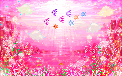
Oh, wow, Karla  ... I love the pink . Of course the animation is fabulous also, thanks for sharing it. Your tag notes are extensive , but thanks so much for taking the time to write that all out; I sure do appreciate the time  that it takes to explain these things  . I'm glad you got a refresher for yourself for using a stroke value LOL. Sometimes the simplest things are the easiest to forget, eh? I learned something new  from your notes that I had never tried before or even thought of  . So after reading your notes I did a test, and I'll be doggone , it worked! You mentioned this "masking" technique. I have never masked an animation before because I always take all the frames of the animation into PSP then invert a selection and delete all the excess that I don't need. I had no idea there was another way to do this  . So I did as you wrote and used a color that is not part of the animation to flood fill the area surrounding the text outline (with empty fill). I copied this layer and pasted it into the animation frames in Animation Shop, and then used Replace Color to change the old color to transparent, and it worked like a charm . I've used Replace Color before to replace a color but never thought about its use for eliminating a color from an animation. So thank you ever so much  for teaching me something new; I love that!  So here's my results using the animated scene that you shared. I didn't use your masking technique for this tag because I wanted to glass the text , so I had to do all the steps in PSP. OMG, there's 29 frames to glass and delete the excess. I wish I had a script written for it haha. I glassed the text fill with Eye Candy 3 and used the settings from Kes' Glass Text Tutorial.  I love your seaside tag as well; the colors are so saturated and look great together. Thanks for giving this challenge a play and for sharing your results, notes, and animation! Judy, I looked at the fireworks animations at Photobucket and in Animation Shop. It's as you say; the animation is displayed at Pb with each D:0 frame display as D:10, but when you take it into AS the display time is true to each frame setting. I have noticed this before that Firefox will display frames with display times less than 10fps as 10. Even my Windows Picture Viewer displays frames less than 10fps as 10. Some of Livepencil's smileys have frames set with display times less than 10fps and I have to change them to 10 when I make tags using them. I only use Firefox so I don't know if any browser displays the true display time settings of an animation.
More Animated Backgrounds: When I saved the pink underwater animation that Karla shared I recognized the file name as one of Sayclub's animations. Any file name with the prefix of "m_r_" is a Sayclub animation from their Hompy site. I'm not exactly sure what Hompy means but they are like Cyworld in that they are like rooms with each one having a background and then other images layered on top to create a scene. This set of images is actually quite cool because they have all kinds of pixel accessories, furniture, dolls, and animated/non-animated backgrounds. Naturally I grabbed everything I could from the site and I have them uploaded to my Sayclub Photobucket account. There's eight albums; the first album is here: http://s530.photobucket.com/user/Saywald/library/m_r_0000-0499. There's hundreds and hundreds of images in those albums; the last two albums have all backgrounds. If anyone wants me to zip up anything and upload it for sharing, then let me know.
|
|
|
|
|
|
De: SilentEyez |
Enviat: 23/07/2018 04:08 |
Hiya gals! Making my routinely visit(s) :-D Thanks for the compliments on my tags :-) I tried and tried many times in the process lol And it is true, the simplest of things can be forgotten and when remembered it is like DUH!!!!!!!!! I had many of those kinds of moments :-D
Oh, I love using the replacing of colors to make transparent! It is soooooo helpful! Just as long as the color is not part of the image/frame and you are good. Though, sometimes, you have to mess with the color settings when replacing because similar colors will be replaced as well.
Timber, I am glad you learned some new techniques! I have done them since forever and learned them by trial and error too :-D There are times when I read a tutorial and get soooo confused. Then I do steps my own way and learn that there are different ways to do something and you get the same outcome. Like when I first learned how to make glitter sigs (text, names, etc.), omg, it was just too frustrating. I could not get them to look "right". And the tutorials I was trying out just confused me. As time passed, I figured out my own way and it was SOOOOOOOOOOOO MUCH EASIER!!!!!!!!!!!!!!! There was NO need to use anti-alias, contracting and filling w/ glitter, and then saving each layer to open in AS. All you really have to do is use the fill as pattern, no anti-alias (for clean look) and type your text as raster. From there, just copy that layer and take straight to AS - go back to PSP and undo and well, you get the idea. And when I first seen a glitter name with a doll next to it... I WAS LIKE OMG!!!!!!!! lol That was my next mission and it was accomplished after many tries :-D
Oh! I have noticed the frames speed thing with some animations. And I figured out that it was because the animation was done in Photoshops animation program (grrr, been trying to remember the name of it for quite some time now). For example, what we use 10 in Animation Shop, it is 1 in that program. Never came across any differences in regard to browsers - or atleast I have not noticed. I use Chrome (since I was gifted my laptop in Xmas 2015). Before that, I was all about FF! Oh, how I enjoyed using FF. And before that, I was an IE person lol
Um, let me see, I know I was going to say something else... I did use glass in my 2nd attempt at the tut challenge. I floated and defloated text layer and promoted the "empty" text to its own layer and applied ECs glass. I used the settings of:
Basic: 6.99, 75, 3, 0, 50, 0, 40, white
Lighting: 6, 59, 100, 40, white, 0, 72,00, 1
Bevel Profile: Subtle Button
I did not realize that the "clear" glass could be done without having to use a different plugin or something. So that made me very happy!
Timber, love your pink Waterpark result! |
|
|
|
|
|
De: justjam |
Enviat: 25/07/2018 23:39 |
OH MY! Timber, I have spent way too long over in your PB collecting Saywald cuties. 
I am not even near finished there. LOL, I already have a couple ideas of how I want to use some of these. Thanks so much for collecting these and sharing them with us.
|
|
|
Primer
Anterior
2 a 16 de 16
Següent
Darrer
|
 Post Codes
 PSP Challenges
 Smileys