Página principal  |  Contacto  

Correo electrónico:

Contraseña:

Registrarse ahora!

¿Has olvidado tu contraseña?

Treehouse Treasures
 
Novedades
  Únete ahora
  Panel de mensajes 
  Galería de imágenes 
 Archivos y documentos 
 Encuestas y Test 
  Lista de Participantes
 ►► How to Join ◄◄ 
 ►Getting Started 
 Please Read 
 -:¦:--:¦:- Messages -:¦:--:¦:- 
 ♥ General 
 ♥ Daily Greetings & Checking In 
 ♥ Broken Links 
 ♥ Post Office 
 ♥ PSP Lessons 
 ♥ Chat 
  Post Codes 
  PSP Challenges 
  Smileys 
  Taggy Me 
 -:¦:-:¦:- Tag Galleries -:¦:-:¦:- 
 ♥ Artist Appreciation 
 ● Autumn 
 ▲Christmas 
 † Halloween 
 ■ Pirate 
 ╠ Steampunk 
 ♣ St. Patrick`s Day 
 :¦: Winter 
 -:¦:--:¦:-Tutorial Links-:¦:--:¦:- 
 ● Animation Shop Tuts 
 ● Autumn Tutorials 
 ● Blinkie Tutorials 
 ● Halloween Tutorials 
 ● Member Tutorials 
 ● Old School Tutorials 
 ● Text Tutorials 
 ● Christmas Tutorials 
 ►►► JUDY TUTS ◄◄◄ 
 ● Animated Filmstrip 
 ● Cutout Text 
 ● Diamond Jiggler Bling 
 ● Diver Smiley Tag 
 ● Flag Glitz Glitter 
 ● Gardenhose Tag 
 ● Glitz Glitter 
 ● Making Movies 
 ● Rainbow Motion Text 
 ● Tiny Box Smiley 
 ● Twinkle 
 ● Vector Text Node Edit 
 ● Watery Grave 
 ►►► KARLA TUTS ◄◄◄ 
 ♥ Coloring Pages: Color & Edit 
 ♥ Dazzle Doll Glitter Sig 
 ♥ Glitter Sig 
 ♥ Kamikaze Halftone 
 ♥ Mish Mash Text 
 ♥ Stellar Bling Text 
 ►►► REBEL TUTS ◄◄◄ 
 ● Chrome Bling`n Text 
 ● Gold & Diamonds 
 ►►►TIMBER TUTS◄◄◄ 
 ● Amazon Southwest 
 ● American Idol Noisy 
 ● Autumn Deco Spice 
 ● Billo Disco Love Trail 
 ● Blackout Scene Text 
 ● Carnivale Cane Text 
 ● Etched Glass Text 
 ● Gold Bling Text Revised 
 ● Groovy Text 
 ● Hearts Aglitter 
 ● Herringbone Frame 
 ● Hollywood Fireworks 
 ● Holy Ravioli Serape Text 
 ● Itty-Bitty Blinkie 
 ● Melted Candle Text 
 ● Patriot Text 
 ● Pique Glitter Drops Text 
 ● Planet X Space Text 
 ● Ribbon Candy Text 
 ● See-Through Text 
 ● Shiny Metal Stud 
 ● Snowman Bar 
 ● Sunrise `n` Set Text 
 ● Windy Halftone Text 
 ►► MEMBER TUTS ◄◄ 
 ● DrumagStudioNF Text 
 ● Glass Text 
 ● Surfer Tag Text 
 -:¦:--:¦:--:¦:--:¦:--:¦:--:¦:--:¦:--:¦:-:¦:- 
 ►►►►►►►►►►►►► 
 ● GBTRT Page 2 
 ● IBBBT Page 2 
 ● IBBBT Page 3 
 ● PTT Page 2 
 ● PXST Page 2 
 
 
  Herramientas
 
General: Tutorial Challenge: E-Plastic Text by EQ Web Designs
Elegir otro panel de mensajes
Tema anterior  Tema siguiente
Respuesta Eliminar Mensaje  Mensaje 1 de 7 en el tema 
De: timber  (Mensaje original) Enviado: 30/07/2018 23:01
E-Plastic


Karla found this tutorial and her results were nothing like the tutorial results, so I thought I'd give this a play and see what results I come up with.  I seem to remember doing this tutorial, or another one like it, long ago and I remember that my results didn't look like the tutorial results either.  I wasn't experienced enough at that time to know why or how to fix it.

This is another "no plugins" tutorial that produces a plastic or glossy effect on text.  The tutorial is available through the Wayback Machine; some of the screenshots are missing, but all of the instructions and settings are there for you.  The hardest part of this tutorial may be in getting your results to look like the tutorial results.  This may be due to the fact that this tutorial was written for PSP6, if you can believe that LOL.

So here is my result using only the letter 'g' as used in the tutorial.  I have added some notes to the screenshot for how I achieved the result.  Each "section" of notes is its own layer on my canvas.


I'll give you a few notes for how I created my letter 'g' a little differently than written in the tutorial.
  • I started with the same font, Garamond, and font size=180 on a vector layer.  Dafont has a font family called Apple Garamond that you may want to use.
  • I noticed that my letter 'g' looked like it had been on a diet, so it was kind of thin.  I went through the tutorial with this thin-looking letter, but my letter looked nothing like the tutorial results, so I added stroke=8 using the same color for the foreground to "fatten" it up.
  • Even after fattening the letter it look more like "Laurel", and I wanted a little more "Hardy", so I stretched it by pulling on the left-middle vector node until the letter resembled the letter 'g' from the tutorial in size and shape.
  • I did not use the alpha channel for this; I kept my text as a vector layer so that I could create a selection from it any time as needed.
  • For the Gaussian Blur part of the tutorial I only applied one blur to the white layer (instead of three), but instead of applying the blur to a de-selected layer, I created a selection from my vector layer, and then applied the blur to the white layer.  By doing it this way the blurred white is contained within the selection and does not extend beyond the text.  I noticed that when I applied the blur to a de-selected layer that the blurred white affected the drop shadow layer.
  • I used the same Inner Bevel settings from the tutorial on my black layer, but I noticed the tutorial didn't have a setting for Ambience, so I set mine to 30.
  • The Negative Image setting is in the Adjust menu in PSP8.


Here's a few examples using a fat font, Tristan Regular.  I've also animated it with different noise settings on different layers.

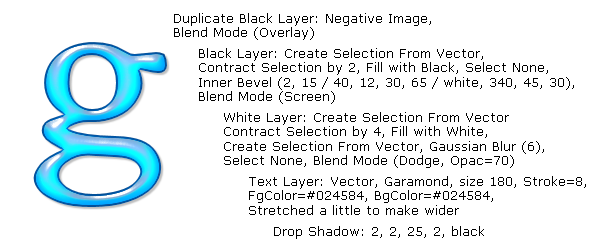
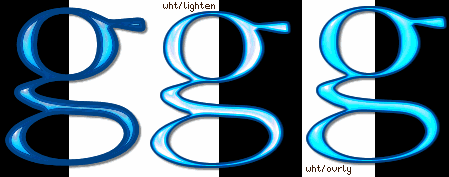
This is a PNG tag following my notes above.

This tag was animated by adding noise (gaussian, 25, mono) to the black bevel layer.  It's a very subtle effect.

This tag was animated by adding noise (gaussian, 15) to the text layer.  Although I used colored noise on this layer it looks like monochrome noise.

This tag was animated by adding noise (random, 15) to the text layer.  The color of the random noise shows through on this tag although it didn't on the tag above.


So there's a few examples to get your started playing with these effects and experimenting.  I have another sample of a tag using different colored letters that I will add to a reply, so this first post doesn't get too long.

I look forward to seeing your play!


Primer  Anterior  2 a 7 de 7  Siguiente   Último  
Respuesta Eliminar Mensaje  Mensaje 2 de 7 en el tema 
De: justjam Enviado: 01/08/2018 00:40
Thanks timber, for sharing your notes on doing this tut.  I tried again.
 
 
I used the font Watermelon Script at size 130.  I used no stroke but the color from the tut.
 
I used the same drop shadow as timber and also the same inner bevel.  This was much easier
 
this time.  LOL, the first time around I got lost on which layer was above which layer.
 
I did use the load to alpha channel, however. I want to play with this more with adding noise, etc.


Respuesta Eliminar Mensaje  Mensaje 3 de 7 en el tema 
De: SilentEyez Enviado: 01/08/2018 06:27
Thanks Timber! And love the results of your play on this tutorial.
Judy, that looks fab! I wonder if I have that font (will have to look through list lol).

I guess I was following along okay but I just did NOT like that there was too much of a "border" look on mine (from contracting + maybe the font I tried with was not the best example). Maybe I should have used a foreground stroke too to "fatten" it up, although the font I used was "fatty" enough lol

I also did not like that it said to deselect and add the blur 3 times. Made no sense to me when it could have been done while selected - so that is what I did after my first attempt. I tried tweaking some of the layers but I did not like how it looked. I wanted it to look LIKE the one in the example: a pretty "G" and no border look to it.

I downloaded Garamond from the link you shared and I will give it another try. I hope it looks better this time.

--------------------------------------------------------------------

OKAY. So I played around with this again.

First "G" is following the EQ*s tutorial + stretching of the "G" and stroke with same color. :-p Second, no stroke and I did a contraction of 2px instead of 4 on the white layer. I like how it turned out (looks like gel to me lol), even though I mixed up the blend mode from another tutorial that stuck in my head! lol I did Lighten instead of Overlay. Third, I fixed the blend mode according to the tutorial. For the drop shadow, I used 2, 2, 50, 2, black. Also, I forgot to mention in previous post that I figured the Ambience would be none/0 since it was not mentioned. So that is what I did with all of my tries. With the previous attempts, I did both alpha and no alpha (but by keeping selection). These attempts are not done with alpha - I find it much simpler.

 photo E-PLASTIC_EX.gif

And here, is the redo and I am HAPPY! this one has only 1 blur of gaus 6.

Respuesta Eliminar Mensaje  Mensaje 4 de 7 en el tema 
De: SilentEyez Enviado: 02/08/2018 13:28
Okay, *whew*, wanted to come up with something pretty or cute to make and I played around AGAIN with the settings. This is what I came up with :-D Hope you like it!

Font: Ginebra Bolds @ 123pt


Respuesta Eliminar Mensaje  Mensaje 5 de 7 en el tema 
De: justjam Enviado: 02/08/2018 22:20
  Awesome, Karla!  Thanks so much for the gorgeous new tag. 
 
I love the font Ginebra Bolds and the noise and doll really make it perfect. 
 
Also, I am glad you showed your results from different attempts! I luv it.
 

Respuesta  Mensaje 6 de 7 en el tema 
De: SilentEyez Enviado: 03/08/2018 05:21
Lol, the tutorial was really something! I am just glad I was finally able to understand it and even did my own twist to it. I am glad you enjoy your new taggies :-) 

Respuesta  Mensaje 7 de 7 en el tema 
De: SilentEyez Enviado: 08/08/2021 11:52

Okay, so I have been wanting to create glassy text without outside filters and looked through the PSP Challenges links. I decided to try this one out, once again, to see if I can get it right by following more closely. That did not happen lol I still ended up with whacky results.

So, I opted for a different approach. From Timber, I learned to do Vector text editing and creating a "border" by using the Foreground and Stroke (it is SO much easier this way).

All right, so I typed my text as Vector using the blue color.
I duplicated the Vector text and edited the color to white.
I duplicated the white text and changed it to black by Adjust > Negative Image. *automatically changes Vector to Raster*
I changed my white and blue text to Raster, accordingly.

By doing this, you eliminate the process of having to save/load an Alpha Channel and just work from your layers. No need to close layers as you work but if you need to, then no problem.

Click on your white text:
Selections > Select All > Float.
Selections > Modify > Contract by 4, Invert.
Edit > Clear (Delete).
Deselect (Ctrl+D).

Add the Gaussian Blur settings (6, 3, 1).
Change blend mode to Dodge, 70% opacity.

Click on your black text:
Selections > Select All > Float.
Selections > Modify > Contract by 2, Invert.
Edit > Clear (Delete).
Deselect (Ctrl+D).

Add the Inner Bevel setting.
Change blend mode to Screen.

Duplicate Inner Bevel layer, Adjust > Negative.
Change blend mode to Overlay.

And that is it. I added the drop shadow to the blue text layer (I tend to add it as separate layer, in case I want to change the opacity of DS).

I did go back to blue text layer and clicked Selections > Select All > Float; Invert.
Then clicked on white text layer and cleared the excess white. I deselected and done.

I cleared the excess white because I had animated it and when I saved it, it had a little more extra white around the text and I did not like it. It was just a preference.

As for the Noise settings: Random, 75% (no Monochrome).
I also used Watermelon Script Demo for this ♥


Primer  Anterior  2 a 7 de 7  Siguiente   Último  
Tema anterior  Tema siguiente
 
©2024 - Gabitos - Todos los derechos reservados